We’ve been asked countless number of times about the origin of the name guch and the thought process that went behind it- so we decided to write a blog post about it. The idea, motivation, and technology was there.
” The world’s first product engine that delivers high quality videos at speed and scale!!”
What our brand needed was a name, a face, a clearly designed brand identity. We put a lot of thought into developing a great brand name that described who we are at our core. We felt we hit the spot when a very peculiar word arrived on our discussion table
The word was “guchami” – A sanskrit word which means I’m moving/I’m going.
As a company we all felt that we were “going” towards a better way of doing creative, a new world order where high quality creative services are rendered at speed and scale. But the best brand names all had one thing in common, they were short and snappy. So finally our brain child had a name
We call it guch!
But we couldn’t easily give up on guchami, so we sneakily added it to our website domain – guch.me
Who we are – A divine definition
“guch is a managed marketplace that will use the collective creative potential of the community (the sangha) with passion (the dharma) to deliver the highest standard of services to its clients (nirvana)”
Logo – The Brand Face
We solve creative problems through a digital platform, so our brand face had to look modern, clean and classy everywhere. It also needed to blend well with the word guch and the concept behind it.
Logo – Design Process


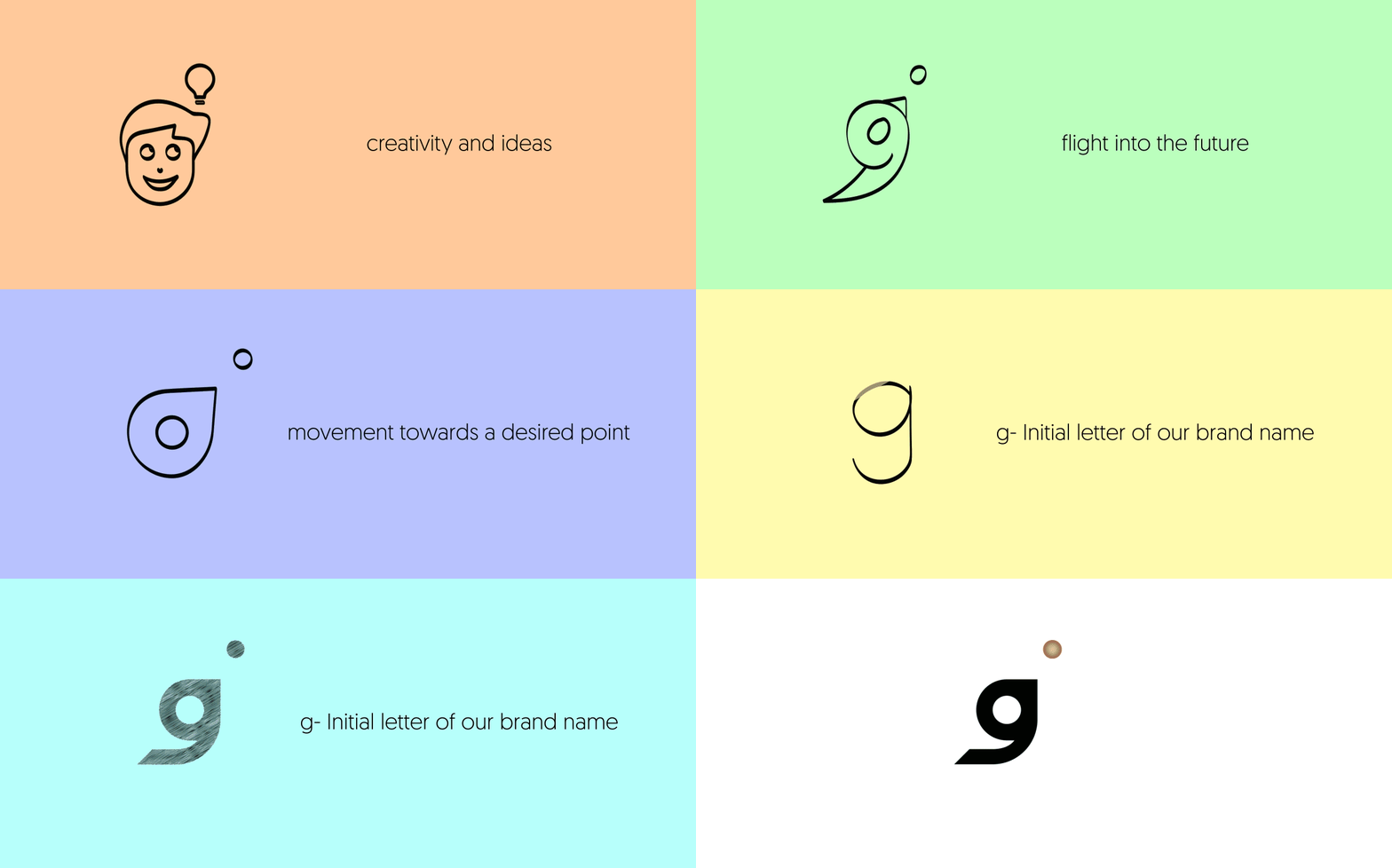
This imagery simply speaks about creativity and ideas

Which transformed into this flying bird representing our flight into the future

This visual represents movement towards a desired point

g- Initial letter of our brand name
Less is more.
We are big fans of minimalism and we found some common shape behaviour in all these images. This gave a composited version of all the above images, with a very minimal and classy symbol which was perfect for the name guch.

Golden Ratio
in the development using golden circles.

Final Logo Mark


logo

Colors
We have chosen a wide palette with lots of secondary colors to give more freedom for creation. But our primary palette is limited with three colors black, white, and a copper color(gradient/flat).

Primary Colors

Secondary Colors
We keep every visual aligned to our brand identity system. Our designers are developing stunning visual images for the brand communications to represent the best of our capabilities.

-Thank you-
And that’s how we took our ideas, our mission and our passion and shaped it into our brand identity
Welcome to the future of creative services, welcome to guch